Most advice about video editing effects is backward for tutorials.
It tells you how to make a video look dynamic. It rarely asks whether the viewer can complete the task faster after watching. In software demos, onboarding walkthroughs, help-center videos, and SOPs, that difference matters more than style.
The useful question isn’t which effect looks impressive. It’s which effect reduces friction. Public guidance on instructional video editing repeatedly points to the same mistake: creators focus on aesthetics instead of comprehension, even though the strongest instructional videos use effects to guide attention and reduce cognitive load, and overuse makes content harder to follow, as noted in this instructional video analysis on viewer comprehension.
A subject-matter expert usually feels that tension immediately. A raw screen recording captures the actual workflow, but it also captures pauses, detours, cursor wandering, and retries. A manual editor in Adobe Premiere Pro or Camtasia can clean that up, but only if someone on the team has the skill and time. Many teams don’t need cinematic editing. They need a reliable way to show the right part of the interface at the right moment.
Beyond Flair How to Use Effects for Clarity
Good video editing effects act like visual instruction. They point, isolate, pace, and simplify. Bad ones compete with the lesson.
For a product demo, a release walkthrough, or internal training, every effect should answer one of three questions:
- What should the viewer look at right now
- What can the viewer safely ignore
- What needs to feel slower, faster, or more obvious
If an effect doesn’t help with one of those, it’s probably decoration.
Style can weaken instruction
A flashy transition between two browser tabs might feel polished. But if the viewer is trying to learn where a setting lives, the transition adds motion without adding meaning. A dramatic zoom can do the same. It signals importance, then lands on the wrong object or moves too quickly for the eye to settle.
Practical rule: In tutorial videos, effects should support task completion, not compete for attention.
Many screen recordings often go off course. A creator notices the raw take feels plain, so they add movement, animated callouts, or repeated zoom punches. The result looks busier but teaches less. Viewers don’t need proof that the editor knows effects. They need help following the sequence.
A better test for every choice
A cleaner standard is simple. Ask, does this help the viewer understand better and faster.
That changes how you judge common edits:
- Zooms are useful when an input field, menu, or checkbox is hard to see.
- Highlights are useful when the cursor path matters.
- Blur is useful when private data appears on screen.
- Pacing edits are useful when dead air weakens retention.
Everything else is optional until those basics are handled.
There are practical ways to apply that approach without learning a full editor. Some teams still work inside Adobe Premiere Pro, Final Cut, or Camtasia. Others use automated workflows that tighten a raw recording first, then layer effects only where they improve clarity. That’s the right order. Effects should solve instructional problems, not hide structural ones.
The Four Essential Effects for Screen Recordings
You don’t need a huge library of video editing effects for tutorials. Most software walkthroughs improve with a small set used carefully.
The short list that matters
The four effects below do most of the instructional work in screen recordings.
| Effect | Instructional Purpose | Best Practice |
|---|---|---|
| Smart zooms | Direct attention to a small UI area | Zoom only when the interface detail would otherwise be hard to follow |
| Highlights and spotlights | Make the active cursor or region easy to track | Use brief emphasis around clicks, selections, or drag actions |
| Blurs and redactions | Hide sensitive information without re-recording | Cover customer data, tokens, internal URLs, and private sidebars before publishing |
| Pacing adjustments | Remove delays that slow comprehension | Cut pauses, retries, and verbal drift before adding visual polish |
Smart zooms
A smart zoom narrows the viewer’s field of view at the moment detail matters. In a billing settings demo, that might mean zooming into a single toggle. In an onboarding video, it might mean enlarging the left navigation while the narrator introduces where a feature lives.
Use zooms when the screen is dense. Don’t use them just because a transition point feels empty.
What doesn’t work is the constant push-pull style common in social clips. That rhythm can feel energetic, but in a tutorial it often disorients viewers and weakens spatial memory of the interface.
Highlights and spotlights
Cursor highlights are often more important than zooms. In a screen recording, the cursor is the hand of the instructor. If it’s hard to see, the lesson gets harder to follow.
A spotlight effect dims the rest of the screen and gives the active area visual priority. That’s especially useful in complex dashboards, admin panels, or CRM flows where several possible controls sit close together.
Use this effect around moments of decision. A button click, a drag-and-drop action, a menu expansion. Skip it during passive explanation, where the cursor isn’t carrying meaning.
The cursor shouldn’t behave like decoration. It should behave like a guide.
Blurs and redactions
This effect is functional, not aesthetic. If your recording contains user names, email addresses, account IDs, internal project names, or API-related details, blur them. Don’t rely on a quick crop if that creates a confusing frame. Keep the lesson intact and hide only what must be hidden.
For support teams and customer education teams, this is often the difference between a reusable asset and a video that can never be shared broadly.
Pacing adjustments
Pacing is an effect in practice, even if teams don’t label it that way. Removing pauses, trimming repeated phrases, and tightening hesitation changes how the viewer experiences the lesson.
A feature release video should feel deliberate. A help article video should feel efficient. A sales enablement walkthrough should move briskly without sounding rushed. Most raw recordings miss that balance on the first take.
A Simple Workflow for Applying Effects
The fastest way to waste editing time is to add effects too early.
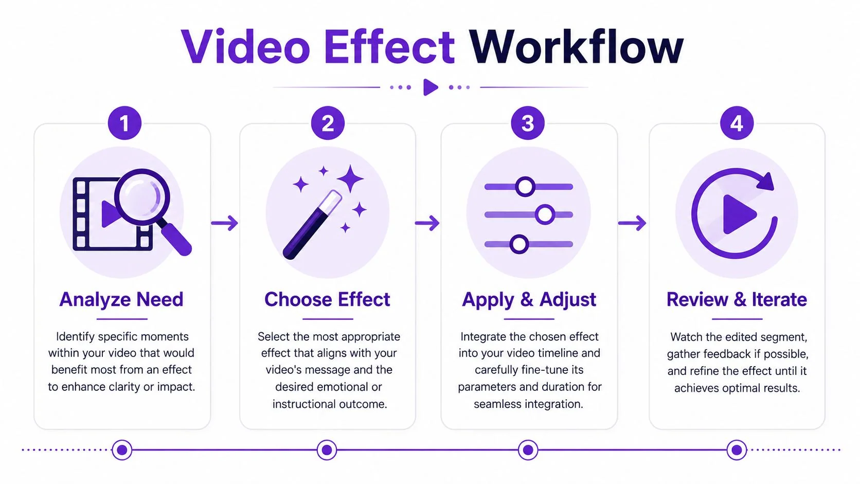
A more reliable method is to use a controlled sequence. Editing guidance for professional workflows recommends finishing a rough cut first, then adjusting timing and pacing, then handling color correction, and only after that adding effects and graphics so visuals support the narrative instead of masking weak structure, as explained in this guide to sequencing video edits.
Start with the message
If the recording rambles, no amount of zooming will save it. First lock the narrative. For a support video, that means the shortest path to resolution. For onboarding, it means the sequence a new user should follow. For internal training, it means the approved process, not the presenter’s improvisation.
A practical way to do this is to edit the transcript before touching the visuals. Teams that want a lighter workflow than a full timeline editor often look for easy video editing software for tutorials so they can tighten wording, remove retakes, and fix pacing without frame-by-frame work.
Tighten rhythm before styling
Once the script is clean, remove dead air and smooth the cadence. Many teams find that these adjustments yield the biggest improvement. A tutorial feels more professional when pauses are intentional and transitions happen close to the spoken explanation.
Three pacing checks catch most problems:
- Pause length. Cut silence that doesn’t help the viewer orient.
- Action timing. Don’t click before the narration sets up the step.
- Retake residue. Remove the start-stop fragments left over from self-correction.
Add effects where they answer a specific need
With structure settled, effects become easy to judge. You’re no longer asking what would make the video look polished. You’re asking what would make a specific moment easier to understand.
Add an effect only when you can name the confusion it prevents.
That standard keeps edits lean. It also helps automated tools work better, because the system isn’t trying to rescue a messy recording with visual tricks.
Mastering Zooms and Cursor Highlights
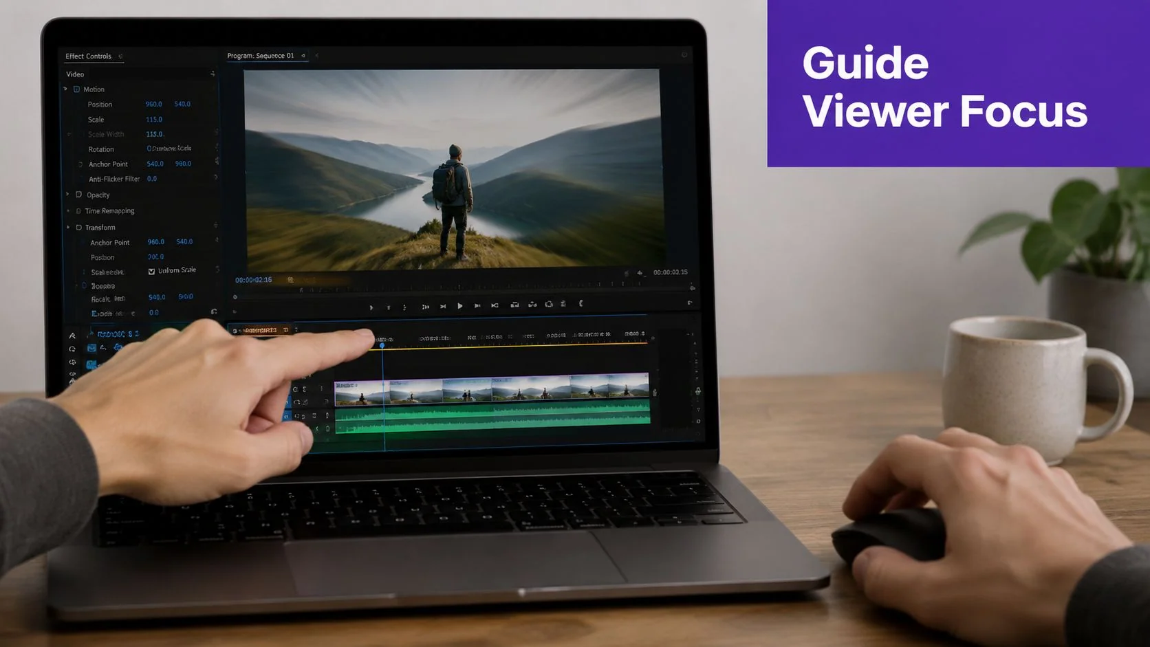
A dense software interface usually needs only two strong signals. Where to look and where the instructor clicked. Zooms and cursor highlights handle both.
When a zoom helps
Take a common example. You’re recording a customer onboarding flow in a product with a left navigation, a central workspace, and a settings drawer on the right. The narrator says, “Open workspace permissions, then change the default role.” On a full-screen capture, that control may be visible, but not obvious.
A static zoom works well if the next few seconds stay inside one area. It enlarges the permissions panel and holds steady while the viewer reads labels and watches the click path.
A smart zoom works better if attention needs to move. For example, the narrator opens a top-right menu, then selects an item in a side panel, then confirms in a modal. The zoom can follow that path smoothly, keeping each action legible without forcing the viewer to search.
Use zooms sparingly when:
- The screen is visually crowded and one control matters more than the rest
- Text size is small in a feature release or support video
- A multi-step action stays within a bounded area for a few seconds
Avoid them when the viewer needs the full screen to understand context, such as comparing two panels or understanding where a workflow sits in the broader interface.
For teams using post-recording zoom controls, visual zooming options for screen tutorials make it easier to test whether a zoom clarifies the scene or just adds movement.
Make the cursor instructional
Most raw recordings have a messy cursor. It circles while the speaker thinks. It overshoots buttons. It hovers over the wrong thing during narration. That doesn’t mean you need a new take. It means you need to shape the cursor into a clearer guide.
Useful cursor treatments include:
- A visible highlight ring for clicks and menu selections
- Smoothing when the natural mouse movement looks jittery
- Click emphasis so viewers can distinguish hover from action
- Temporary enlargement when precise location matters
These effects are strongest in product demos, help-center clips, and internal SOP videos where the viewer is expected to imitate the exact path on screen.
A short example makes the distinction clear. In a CRM walkthrough, the narrator says, “Filter by account owner, then export the current view.” If the cursor glides across several controls before landing, viewers hesitate. If the cursor path is cleaned up and each click is visually emphasized, the workflow becomes obvious.
This demo format shows the principle in motion:
What to avoid
A few habits hurt more than they help:
- Rapid zoom chaining makes the interface feel unstable
- Oversized click animations draw attention away from the software itself
- Permanent spotlighting turns emphasis into background noise
The right setting is usually the least noticeable one that still removes confusion.
Protecting Data and Maintaining Your Brand
A tutorial can be clear and still be unsafe to publish. It can also be accurate and still look inconsistent with the rest of your customer education library. Both problems show up in screen recordings all the time.
Blur is not optional
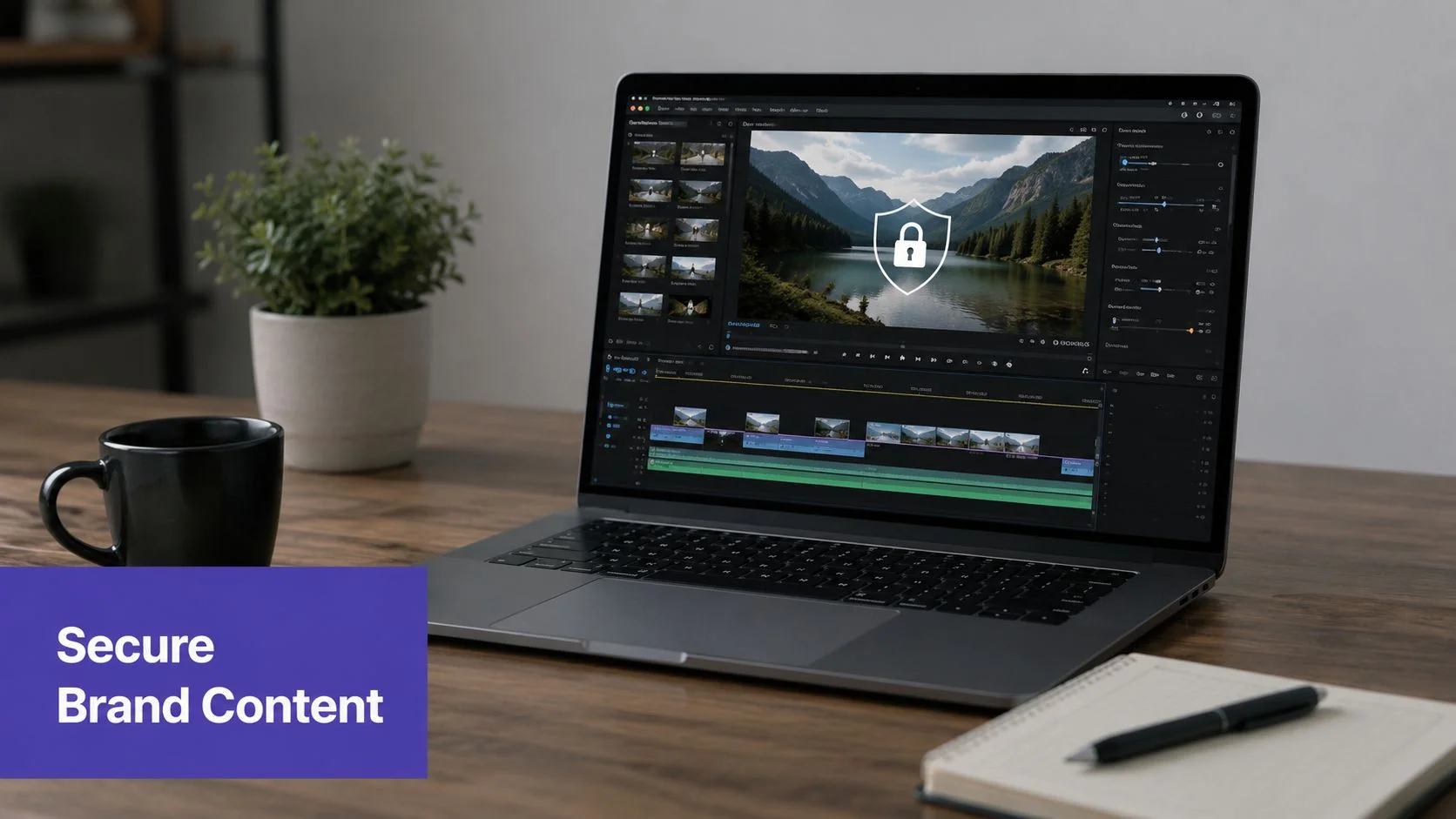
In real product demos and support recordings, sensitive information slips in easily. A sidebar exposes a customer name. An admin panel shows an internal project label. A browser tab reveals something that shouldn’t leave the team. Those details don’t become harmless just because the video is instructional.
Blur and redaction effects should be part of the review process for any business publishing software videos. That includes:
- Customer identifiers in support reproductions
- Internal URLs and environment labels in training videos
- Credentials or tokens that appear during setup
- Private communication snippets in side panels, notifications, or tabs
For teams that need a repeatable process, guidance on blurring sensitive data in tutorials is more useful than trying to crop around every issue after the fact.
Brand consistency changes how the video feels
Viewers notice when every help article video looks like it came from a different team. One has bright callouts. Another uses mismatched fonts. A third uses default colors that don’t resemble the product or brand at all.
Brand control matters because instructional videos aren’t isolated assets. They sit in onboarding flows, knowledge bases, release notes, LMS modules, and sales follow-up sequences. Consistent colors, type, title cards, and highlight styles make those materials feel maintained and trustworthy.
This is also where platform requirements matter. Teams in enterprise settings often need security and governance features along with editing controls. Tutorial AI is one option in that category. It supports blur effects, brand kits, and enterprise requirements such as SOC 2 + GDPR, and it’s used by organizations including Bosch, Deutsche Bahn, Intesa Sanpaolo, Microsoft, and UNICEF.
A tutorial doesn’t feel professional because it has more effects. It feels professional when nothing on screen looks accidental.
From Raw Screen Capture to Polished Asset
Video editing didn’t start with software timelines. The craft developed across more than a century, from early motion-picture work in 1890, to the Moviola in 1924, to the Academy Awards recognizing film editing in 1934, and later to digital compositing systems such as Quantel’s Harry in 1985, which could process only 80 seconds of uncompressed 8-bit video at a time, according to this history of video editing technology. The point isn’t nostalgia. It’s perspective. Advanced effects used to require specialized systems and specialized operators.
Now the hard part isn’t access. It’s judgment.
The strongest tutorial videos use video editing effects with restraint. They tighten pacing, guide attention, protect sensitive information, and keep the interface legible. They don’t try to impress the viewer with motion. They help the viewer finish a task.
That same clarity standard applies beyond software tutorials. Teams producing customer education, internal training, and even media formats adjacent to demos can borrow the same discipline. This is one reason resources like Podmuse B2B podcast insights are useful. They show how production choices affect understanding and perceived quality, even when the format isn’t a screen tutorial.
A polished asset also shouldn’t stop at video. One cleaned-up recording can become a written article, a support doc, a release walkthrough, or a multilingual training asset. That’s where modern workflows are most practical. You record once, refine the message, apply only the effects that help comprehension, and publish in the formats your audience already uses.
If your team records product demos, onboarding flows, support videos, or internal SOPs, Tutorial AI gives you a way to turn one screen recording into a polished tutorial and a matching article without doing traditional timeline editing for every asset.